
| View unanswered posts | View active topics |
It is currently 17 Dec 2025, 11:06 |
|
All times are UTC [ DST ] |
Romulan Interface Preview
Moderators: Kenneth_of_Borg, Zeleni, skeeter, Matress_of_evil, mstrobel, vjeko1701, starfleet.command
|
|
Page 1 of 3 |
[ 69 posts ] | Go to page 1, 2, 3 Next |
| Print view | Previous topic | Next topic |
Romulan Interface Preview
| Author | Message |
|---|---|
|
Lieutenant Junior Grade   Joined: 12 Sep 2005, 01:00 Posts: 187 Location: Adelaide, Australia |
Ok, so I have been working on an interface which would be unique to the Romulan Star Empire.
Some things to keep in mind: This is a teaser  Although the concept is complete, it is still very much a work in progress. It is designed to be minimalistic, with all panels able to be toggled on/off to suite which information you wish to have on the screen at any particular time. The colours are by no means final. I am fine tuning constantly. All the elements of the UI have been planned for, however you wont see many of them in this one image. Rest assured they are catered for. Some elements are clearly just ripped straight out of the game. Expect them to be different in the final version  Any thoughts, criticisms, or questions are welcomed.  Attachments:
Supremacy-Romulan-Teaser-5.png [ 304.85 KiB | Viewed 25596 times ] _________________ "...without my pants" |
| 03 Jul 2010, 05:59 |
|
|
Crazed Emissary of the Photoshop   Joined: 13 Mar 2009, 20:17 Posts: 2091 Location: Krapina, Croatia |
I don't know about anyone else, but I think it's brilliant. Can't wait for the final result.
 BTW: What about Klingon and Cardassian interfaces, I saw similar pictures of them, but were they ever finished? _________________  |
| 03 Jul 2010, 09:10 |
|
|
Evil Romulan Overlord of Evil - Now 100% Faster!   Joined: 02 Dec 2004, 01:00 Posts: 7392 Location: Returned to the previous place. |
We don't know, v. Joel posted them (He created the current Fed one as well I believe) but I haven't heard anything from him since. And apparently Mike only recently saw them lol.
Brilliant work Silvercliff, i'm glad I pounced on you on MSN now... _________________ "Anyone without a sense of humour is truly at the mercy of the rest of us." |
| 03 Jul 2010, 11:29 |
|
|
Admiral   Joined: 14 Jan 2009, 10:17 Posts: 2042 |
IMO, the UI elements take up too much space on the screen, due to their somewhat irregular shape. The space could be better used, like in the Fed UI. Mid to late game, screen real estate is extremely important. I guess the UI elements could be made collapsible, like in Armada 2526, through a button or a hotkey. I personally like to see all elements at all times.
I also like the Fed UI disposition of said elements better - resources on the left, system in the bottom, etc. Feels more natural I think. I also don't like much "stylized" fonts in games, they look nice the first few games but then they tend to be tiring; fonts can be changed through a mod, and that's what usually happens. But it does look nice and Romulan'ish. |
| 03 Jul 2010, 12:38 |
|
|
Crazed Emissary of the Photoshop Joined: 13 Mar 2009, 20:17 Posts: 2091 Location: Krapina, Croatia |
Well, I would make the Task force menu smaller.
_________________ |
| 03 Jul 2010, 12:41 |
|
|
Ship Engineer   Joined: 10 Jul 2006, 01:00 Posts: 5130 Location: Space is disease and danger, wrapped in darkness and silence! |
It still looks sweat.
 _________________ |
| 03 Jul 2010, 18:20 |
|
|
8 of 9, Tertiary Adjunct of Unimatrix 001   Joined: 17 Dec 2009, 01:47 Posts: 249 Location: Le Canada |
Kenneth_of_Borg wrote: It still looks sweat. SWEET. You meant sweet. At least I hope you meant sweet. And yes. I agree that the interface looks amazing. Purely Romulan . 8 of 9, tertiary adjunct of Unimatrix 001_________________ We are the Borg. Prepare to be assimilated. Your creative distinctiveness will be added to our own. Your creative minds will adapt to service us. Resistance is, and always has been, humorous.  May... now with expectedly warm weather! |
| 03 Jul 2010, 18:38 |
|
|
Lieutenant Junior Grade Joined: 12 Sep 2005, 01:00 Posts: 187 Location: Adelaide, Australia |
Ok to address some of the concerns.
To the issues of space. There is no right-click menu in my UI. The panel on the left is how you navigate instead, and will only be visible when you are mousing over to select the screen to navigate to. Do not worry about the size of the task force area. In my mind it was always going to scale from basically nothing, up to the size it is now depending on how many ships/taskforces you have in the system at the time. The other panels will have similar scaling. Keep in mind that, like I said above, every panel can be turned 'off' if you want to. In terms of overall size, the elements will all be smaller in the final version, I decided that early on. So all in all, dont worry too much about space  In terms of the arrangement of UI elements, the 'backwardness' was deliberate. Romulan text is written bottom-to-top, right-to-left, so the change of position reflects the difference to Federation standards. Fonts are hard I havent found a font I was happy with yet :S I would love to have a Romulan font, but they just dont seem to work._________________ "...without my pants" |
| 04 Jul 2010, 04:20 |
|
|
Chief Software Engineer   Joined: 11 Aug 2005, 01:00 Posts: 2688 |
Looking pretty good
. I'm curious, what are the popups on the left-hand navigation buttons meant to display? What are the other buttons/popups on the top and bottom? With regards to real estate, maybe it would be better to put the planet view and task force list in the same popup (i.e. have them replace each other, not display at the same time). Seeing as those are two of the most commonly used panels, players might get annoyed by the amount of space consumed by keeping them both open on opposite edges of the screen. If you put them together, the user could probably keep the top pane closed most of the time.Any ideas for fleet management? There needs to be a way to view the individual ships in each fleet, and the player must be able to reassign ships to different fleets. The new Federation UI is similar to the old one but with drag and drop support; I'm not thrilled with it, but it's an improvement. This could be an opportunity to come up with an even better solution. Can you send me a copy of the Photoshop file for this screen? I just want to tinker around with a couple ideas. Don't worry if the layers are a mess or anything. _________________ Lead Developer of Star Trek: Supremacy 253,658 lines of code and counting... |
| 04 Jul 2010, 05:02 |
|
|
Chief Software Engineer Joined: 11 Aug 2005, 01:00 Posts: 2688 |
Another thought about the task force popup: using a left-to-right, top-to-bottom flow layout could be problematic, as the widths of each item are not fixed. Each fleet's text will grow or shrink based on the description of its current orders. Thus, when a user right-clicks a fleet to assign a new order, the layout may shift, and the fleet they had selected may no longer be in the same position. I tend to think that's a bad UI behavior.
We could get around this by setting a fixed width for each task force in the list, but they wouldn't be as nicely spaced as they are in your mockup. There would be two, maybe three columns at most. It might be better to just use a vertical list, which would mean putting the task forces in a side panel. _________________ Lead Developer of Star Trek: Supremacy 253,658 lines of code and counting... |
| 04 Jul 2010, 05:11 |
|
|
Chief Software Engineer Joined: 11 Aug 2005, 01:00 Posts: 2688 |
OK, one last thing--did you take the standard backdrop and adjust the colors to tint it green-purple? Because that looks really slick...
Maybe we should throw some bluish-green and purple into the UI too  . It worked well for BotF. . It worked well for BotF._________________ Lead Developer of Star Trek: Supremacy 253,658 lines of code and counting... |
| 04 Jul 2010, 05:14 |
|
|
Evil Romulan Overlord of Evil - Now 100% Faster! Joined: 02 Dec 2004, 01:00 Posts: 7392 Location: Returned to the previous place. |
BOTF had different backgrounds for all of the different Empires - everyone probably knows this. In BOTF though, the colours weren't just different, the backgrounds actually were different. If should be easy enough to simply adjust the colours of the background image for the different Empires though. It would be a nice tip-of-the hat to BOTF, and it would certainly make the game look prettier and more varied, even if it is technically the same image.
If we had the different backgrounds Mike, and they followed a naming convention the game could recognise (FederationBackground, KlingonBackground, etc), then could you program the game to automatically load them depending on the players Empire selection instead of the default? (The current Federation one would obviously continue as the default as well) _________________ "Anyone without a sense of humour is truly at the mercy of the rest of us." |
| 04 Jul 2010, 09:03 |
|
|
Chief Software Engineer Joined: 11 Aug 2005, 01:00 Posts: 2688 |
Well, Silvercliff has inspired me, so I took his basic design and started playing around with it a bit. I figured I'd share what I have so far. I didn't like what I had done with the sides or the bottom, so I hid them away for now. Here's what I came up with for the upper part of the screen, after several revisions:
Attachment: romulan_top.png [ 309.89 KiB | Viewed 25561 times ] It's still a work in progress, obviously. _________________ Lead Developer of Star Trek: Supremacy 253,658 lines of code and counting... |
| 04 Jul 2010, 09:33 |
|
|
Chief Software Engineer Joined: 11 Aug 2005, 01:00 Posts: 2688 |
Moved things around a bit to try to balance out the left and right sides. I still don't like my decoration thing in the upper-right corner or the scrollbar. Waiting for Silvercliff to come up with some more of his brilliant ideas
.Attachment: romulan_wip2.png [ 1.7 MiB | Viewed 25552 times ] _________________ Lead Developer of Star Trek: Supremacy 253,658 lines of code and counting... |
| 04 Jul 2010, 13:12 |
|
|
Aesthetics Surgeon   Joined: 24 Oct 2006, 01:00 Posts: 1350 Location: Croatia |
"Backwardness" is brilliant idea Silver, I don't won't any similarities in feds and roms Ui's afterall they are completely different cultures.
 _________________ Carpe Diem |
| 04 Jul 2010, 13:44 |
|
|
Admiral Joined: 14 Jan 2009, 10:17 Posts: 2042 |
Yeah, brilliant, just like having it all written in Romulan. But wait, it's in english... maybe because the players are human, not romulan?
well, maybe the chinese will like it better that way. And since they're many... hehe. |
| 04 Jul 2010, 16:41 |
|
|
Chief Software Engineer Joined: 11 Aug 2005, 01:00 Posts: 2688 |
I've been toying around with Cliff's idea of using popups to present information when needed and keep it hidden otherwise. Here's design where the task force list is displayed in an overlay:
Attachment: Closed.png [ 999.17 KiB | Viewed 25511 times ] Attachment: Open.png [ 985.73 KiB | Viewed 25511 times ] Ignore the colors. _________________ Lead Developer of Star Trek: Supremacy 253,658 lines of code and counting... |
| 05 Jul 2010, 15:03 |
|
|
Starfleet Ambassador to the French Peoples   Joined: 19 Jul 2009, 12:25 Posts: 471 Location: Les Pennes Mirabeau (13) France |
wow great pictures...congrats!!!
_________________ I'm a Starfleet Security member. Spammers, never venture to come drag bad posts, me and my friends (admin and moderators) we are a very large army ready to battle you. Be warn!!! 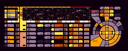 |
| 05 Jul 2010, 15:31 |
|
|
Admiral Joined: 14 Jan 2009, 10:17 Posts: 2042 |
Quote: Ignore the colors. Actually, though silvercliff's colors look more romulanish, I think yours may actually be better for a game, they're more confortable and easier on the eyes IMO. It all looks closer to the Fed UI, which IMO is a positive point. I'm looking at it from a 4X gamer's PoV, rather than a trekkie's. As always.  |
| 05 Jul 2010, 17:12 |
|
|
Chief Software Engineer Joined: 11 Aug 2005, 01:00 Posts: 2688 |
.Iceman wrote: Actually, though silvercliff's colors look more romulanish, I think yours may actually be better for a game, they're more confortable and easier on the eyes IMO. It all looks closer to the Fed UI, which IMO is a positive point. I'm looking at it from a 4X gamer's PoV, rather than a trekkie's. As always. . Once we have a final design, I'll bust out the color wheel and try to optimize the palette._________________ Lead Developer of Star Trek: Supremacy 253,658 lines of code and counting... |
| 05 Jul 2010, 19:51 |
|
|
Aesthetics Surgeon Joined: 24 Oct 2006, 01:00 Posts: 1350 Location: Croatia |
Looks nice... keep us informed.
_________________ Carpe Diem |
| 05 Jul 2010, 22:04 |
|
|
Genetically Altered Manual Labourer  Joined: 17 Aug 2009, 01:31 Posts: 2083 Location: Passed out on the floor after math mistake discovered by Hawking |
Wow, missed a lot of cool stuff while away on a 4th of July Holiday. However I saw Silvercliff's and Mike's designs on an iPad in an Apple store.
Comment on Silvercliff's UI: I like it. Comment on mstrobel UI: I also like it and I am so glad you are working on improving Task Force deployment. What I like about both of them compared to BOTF and other similar games is the simpler, cleaner look. Perhaps keep the same sound effect when you activate things. I just keep thinking, If we change this thing too much, it won't be the same game. Bashir |
| 06 Jul 2010, 23:22 |
|
|
Genetically Altered Manual Labourer Joined: 17 Aug 2009, 01:31 Posts: 2083 Location: Passed out on the floor after math mistake discovered by Hawking |
Idea for task force deployment:
What if you had each ship in the sector listed vertically but next to each ship was a drop down with a list of task forces also in the sector with “Not Assigned” as the top selection? Select the task force you want for the particular ship – the one selected is the one displayed in the drop down. There would also have to be a way to create a new task force name - Concatinate the phrase "Task Force" at the head of it. This would be quick. You may also want to be able to filter what is displayed, by ALL or a particular Task Force Name and have some way of making it clear that you are in filter mode. Perhaps if you click on another sector and come back the filter has been canceled so that we don't find ourselves "losing" task forces by mistake. Like this: Not Assigned Task Force Delta Task Force Charlie Task Force Resupply Reallocate Bashir |
| 07 Jul 2010, 00:30 |
|
|
Admiral Joined: 14 Jan 2009, 10:17 Posts: 2042 |
mstrobel wrote: Any ideas for fleet management? There needs to be a way to view the individual ships in each fleet, and the player must be able to reassign ships to different fleets. Going with the Open.jpg pic you posted, you could have the Fleet Command panel display fleets (named fleets, like 1st Battle Fleet) - each item in the panel would represent one fleet, displaying fleet name and total # of ships in that fleet - and clicking(/hovering) over one item would open a new panel to the right displaying all ships in the fleet vertically, by class/type. Then, from that panel, you could drag and drop any ship type to the fleet panel on the left; once you drop the ships, a popup window lets you select # of ships to transfer. Not sure if that's clear? |
| 07 Jul 2010, 00:34 |
|
|
Chief Software Engineer Joined: 11 Aug 2005, 01:00 Posts: 2688 |
.Iceman wrote: Going with the Open.jpg pic you posted, you could have the Fleet Command panel display fleets (named fleets, like 1st Battle Fleet) - each item in the panel would represent one fleet, displaying fleet name and total # of ships in that fleet - and clicking(/hovering) over one item would open a new panel to the right displaying all ships in the fleet vertically, by class/type. Then, from that panel, you could drag and drop any ship type to the fleet panel on the left; once you drop the ships, a popup window lets you select # of ships to transfer. Not sure if that's clear? This is actually very similar to what I was thinking. I'd been tossing around the idea of creating another popup to display the ships within the selected fleet, though I think that could clutter the screen if it's activated automatically by selecting a fleet. It might be less invasive to have the ship list replace the system view at the bottom. Alternatively, we could go with the second popup but have it be triggered explicitly, say by clicking a "redeploy fleets" button like we have now. Actually, now that I've gone through this again in my head, I'm not sure either of those would work. We would need space to display the selected ship's stats like we do now, and those stats wouldn't fit in the system view region. Moreover, the stats have a variable height depending on the type of ship selected, so displaying the stats in a popup along with the individual ships would result in the ship list jumping up and down as the height of the stats changes. We also need to display trade routes, and I'd like to get rid of the Military/Economy buttons. I don't like forcing the user to toggle between different display modes to view trade routes vs. task forces. FYI, named fleets are definitely on the table. Technically, every object in the game already has a name that can be overridden. It's just been a low priority to implement named fleets. _________________ Lead Developer of Star Trek: Supremacy 253,658 lines of code and counting... |
| 07 Jul 2010, 02:45 |
|
|
Admiral Joined: 14 Jan 2009, 10:17 Posts: 2042 |
Here`s what I had in mind. Ignore my superb artistic talent, and the Fed pics taken from the manual.
 I´m sure there can be more and better info in the fleets and ships slots, these are just examples. Changing fleet orders could be done via right click popup menu in the fleet panel (left side). Quote: This is actually very similar to what I was thinking. Cool. Great minds think alike. Quote: I'd been tossing around the idea of creating another popup to display the ships within the selected fleet, though I think that could clutter the screen if it's activated automatically by selecting a fleet. Well, it´s fleet deployment, you´re not going to be doing it all the time, only occasionally. Quote: It might be less invasive to have the ship list replace the system view at the bottom. It´ll look a bit disjointed though. And the ship layout won´t be as readable IMO. Quote: FYI, named fleets are definitely on the table. Technically, every object in the game already has a name that can be overridden. It's just been a low priority to implement named fleets. Good, because that´d be one of the first things being asked for if it was not in the game. Attachments:
Open2.PNG [ 963.96 KiB | Viewed 25437 times ] |
| 07 Jul 2010, 14:00 |
|
|
Chief Software Engineer Joined: 11 Aug 2005, 01:00 Posts: 2688 |
In essence, I think this works pretty well. My only concern is that if fleet deployment is a special mode that you have to enter, like it is now, then there's an extra step required just to quickly glance at all the ships in a fleet and, for example, assess their shield and hull strength. If there's not a special mode for fleet deployment, the popup would have to be automatically opened whenever a fleet is selected, and that would quickly clutter the screen. It's hard to gauge for sure if either of these is a problem without seeing them in action.
_________________ Lead Developer of Star Trek: Supremacy 253,658 lines of code and counting... |
| 07 Jul 2010, 16:32 |
|
|
Admiral Joined: 14 Jan 2009, 10:17 Posts: 2042 |
For a quick glance, you could just have the popup in the starmap when hovering over the fleet´s icon, maybe when you´re zoomed in beyond a certain threshold. A simple tooltip, with # and class of ships:
3x Frigate II 4x Cruiser II En Route to Romulus ETA 3 turns That sort of thing. When you´re confortable with the game, it should be enough for a quick assessment. If you need more info, then go to the fleet deployment screen. |
| 07 Jul 2010, 16:44 |
|
|
Chief Software Engineer Joined: 11 Aug 2005, 01:00 Posts: 2688 |
.Iceman wrote: For a quick glance, you could just have the popup in the starmap when hovering over the fleet´s icon, maybe when you´re zoomed in beyond a certain threshold. A simple tooltip, with # and class of ships: 3x Frigate II 4x Cruiser II En Route to Romulus ETA 3 turns That sort of thing. When you´re confortable with the game, it should be enough for a quick assessment. If you need more info, then go to the fleet deployment screen. This has actually been added already . Well, sort of: since you could have multiple fleets in a sector, the tooltip currently shows the number of fleets and number of ships. It doesn't dive into the health of the individual ships. Currently, in the Fed UI, clicking on a fleet replaces the system view with thumbnails of the ships within that fleet, each one having health bars for shields, hull, and fuel. My Rom UI mockups currently have nothing like that. Do you think it's okay if you have go into fleet deployment mode to view that information? It sounds reasonable enough, but I have to wonder if it would become an annoyance after a while._________________ Lead Developer of Star Trek: Supremacy 253,658 lines of code and counting... |
| 07 Jul 2010, 17:16 |
|
|
Admiral Joined: 14 Jan 2009, 10:17 Posts: 2042 |
Well, you can always color code the ships that have sustained heavy damage (in red, maybe even moderate damage in yellow), to reduce the need to check ship health.
3x Frigate II 4x Cruiser II En Route to Romulus ETA 3 turns would mean at least one cruiser is heavily damaged and needing repairs asap. As for having multiple fleets in a sector, the diference would be that when pointing at a specific icon, you´d get the above for that fleet, pointing to another icon would do the same for that other fleet. Seperate tooltips for each fleet. Since the icons are apart, should be easy to do. That was the reason for the zoomed in comment. edit: I meant the above for fleets of different empires. For fleets of the same empire, the tooltips could get quite long... |
| 07 Jul 2010, 17:32 |
|
|
|
Page 1 of 3 |
[ 69 posts ] | Go to page 1, 2, 3 Next |
|
All times are UTC [ DST ] |
Who is online |
Users browsing this forum: No registered users and 1 guest |
| You cannot post new topics in this forum You cannot reply to topics in this forum You cannot edit your posts in this forum You cannot delete your posts in this forum You cannot post attachments in this forum |